What is “Framer MUC Agenda App” ?
Objective: Giving registered attendees of Framer Munich Meetup a sneak peak on what is happening on June 26th. Let new designers know how amazing interaction design can be. Serve as an example on why and how to document interaction design.
Main concept
With only 3 views a Framer prototype will inform about the upcoming Framer Munich Meetup and will be enjoyable as a Framer prototype. Information will be structured by importance, so users can get everything about the meetup with just two or three touches.
-
Meetup Information: First priority is What, When and Where. Users should be able to figure out their availability.
-
Feature animation: A Speech recognition is charging users emotionally and getting them exited about the meetup. (Feature transitions can highlight a meetup topic or sponsor)
-
Schedule Overview: information to empower their decision

MVP definition
The first prototype will cover the most important information for attendees and one featured animation:
- What (Framer Meetup Munich)
- When (June 26th)
- Where (at Google Germany)
- What is happening (Schedule)
- Who is speaking
- Which workshops are available
- What should every attendee bring
In Version 2, additional information could be useful:
- Hashtag usage ( e.g. #FramerMUC )
- Speaker information
- Sponsor information
- Workshop details & follow up information
User group
Munich based designers with or without coding background. Interested in interaction design and product documentation.
User story: Annie has never written code before but she is used to designing mobile applications. Her colleagues demand more detailed animations and she wants to create them in time so that her product becomes more polished.
Job story: When a user has limited resources, time and doesn’t want to spend money or too much time yet, he has to go to a meetup and see what other designers are doing, so he can decide about learning or investing time in Framer.
User needs: “learning more about Framer”, “level up their career profile” or “join the animation movement”
User painpoints: “Not being able to code”, “Social awkwardness” and “company regulations”
Usecases: Feel free to add some
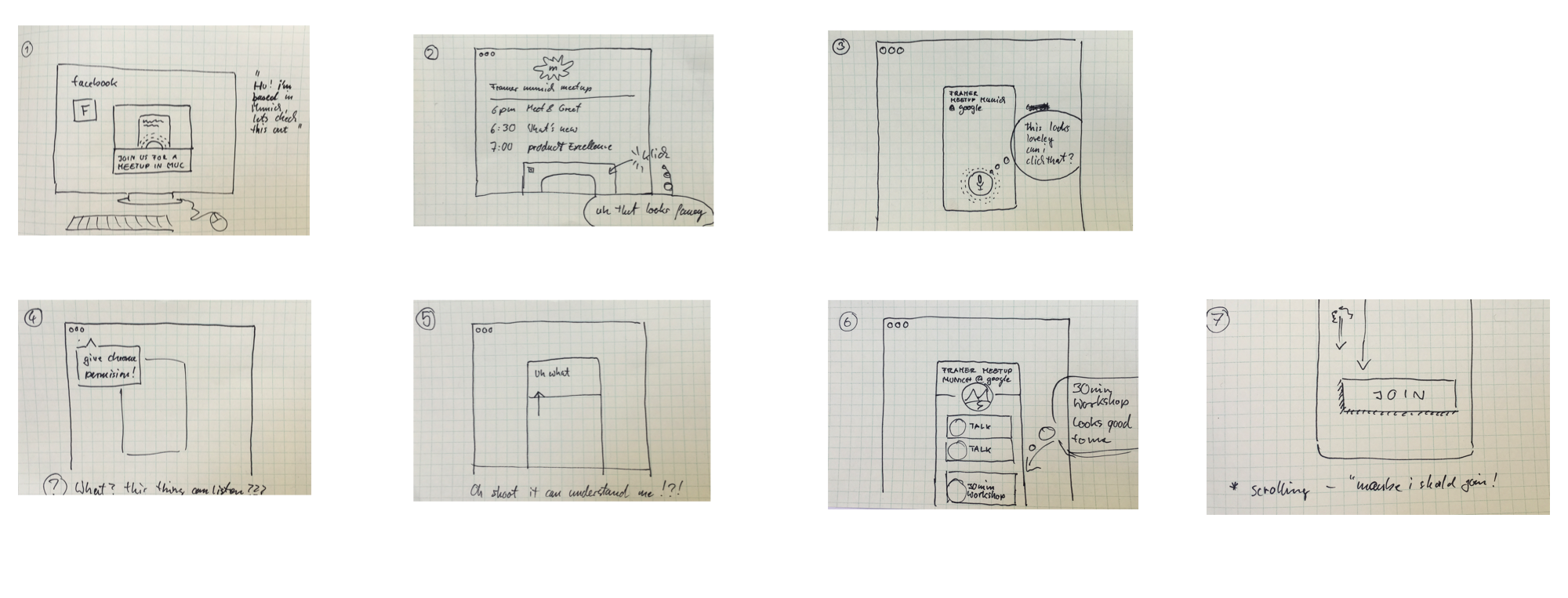
Exemplary Userjourney

Features
Note: A suggestion which structure I’m working with, can be found here. In general my recommendation is to have a structure and keep it.
Meetup Information

Objective: Inform potential attendees about what is happening (a meetup about Framer) when (June 26th) and where (at Google Munich)
Scenario: As soon as the app opens a button is offering speech input. When tapping it, our feature animation asks you to say something. Tapping the voice button will activate it and it starts pulsing. The pulse has to be visible enough to get attention but should not trigger emotions such as stress or hurry. A calming mindset is recommended.
Our test confirmed, one button works just fine! Start screen is a bit boring.
Measurements
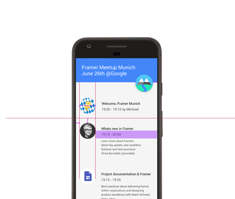
- Title is written in 26 sp
- Background color is #000 or rgba(0,0,0,1)
- Voice Button is 110 x 110 dp centered
Feature Animation
 Open prototype
Objective: give users and attendees a sneak peak about what Framer can achieve.
Speech recognition is a highly demanded feature and Framer is able to do that. A browsers speech api (W3c Statement on speech specification) can be accessed via Framer and listen to a user’s voice. Example for Google Voice input Framer wrote also an article about how to build Speech recognition
Scenario: A user says “hello” and the speech recognition will display what they said, wait for 10 seconds and provide the schedule overview.
To be tested: By letting them go through with any voice input, Framer is just showing off. Our theory: accuracy isn’t necessary to engage a user.
Measurements
Pulsing circle animation is the inner circle scaled by 2.
time: 2
curve: "easeOut"
Schedule Overview
 Open prototype
Objective: Let the user read and decide fast about the meetup’s schedule and content and what they are interested in or whether they should join at all.
MVP: Just a listview with a schedule. Version 2 could offer detailed information on talks and speakers.
Scenario: Has a user said something, the meetup schedule will slide in. A scrollview allows them to explore the whole meetup and its content. A shrinking and scrollable header pattern is giving more screen space to read.
Scenario: Is a user tapping on the little sponsor logo (#isarvalley) a website will open a link provided by the sponsor.
To be tested: Is a short workshop description enough to convince a user to join or should it be more detailed? Will users understand the necessity of a macbook?
Patterns
Scrollable header
Objective: Encourage companies to host a Framer Meetup by giving a sponsor the prominent place of a fab.
In a non scrolled state, the sponsor button is looking prominent and big with 110 x 110 dp. Scrolling a list will minimize the button and move it to the right or left of the top bar.


Deliverables
The idea is to have a prototype available for sharing. By definition this project is in a published state if a Framer prototype is available:
